[Work in progress]
Bet on yourself,
without losing a dime
Moneyvation helps people stay motivated and accountable without the fear of failure.
“I bet you that I will go to the gym!”
Problem
Small bets are easy to ignore, but big bets feel too risky to make.
Money can be a strong motivator. Let’s imagine a friend struggling to get to the gym. To stay motivated, they make a fun, low-stakes bet with you. They start strong, but life gets busy, motivation slips, and they lose the bet. So what if they made a bigger wager, one that actually felt meaningful?
A bet that pushes, but doesn’t punish. Money is withheld—never lost—and earned back in small wins that build momentum.
Moneyvation leverages the motivating power of a big bet while removing the fear of a big loss. The idea is that instead of losing the wager altogether, it’s just simply held by an accountability partner. Complete a task, earn a little back. Miss one? Add more to your pot. The stakes feel real, but the loss doesn’t, helping build momentum one step at a time.
Stakes need to feel real—without feeling like a real loss.
It’s a Catch-22: you need high stakes for the bet to feel real, but when motivation is low to begin with, betting feels risky. To soften the risk, people either lower the stakes, which lowers the motivation, or they shirk away from betting at all, staying stuck.
Solution
Insight
How it works
Create Bet
Start by defining a goal and setting the terms (wager, payout amount, schedule, etc.)
Place It
Place the bet with an accountability who holds onto the pot
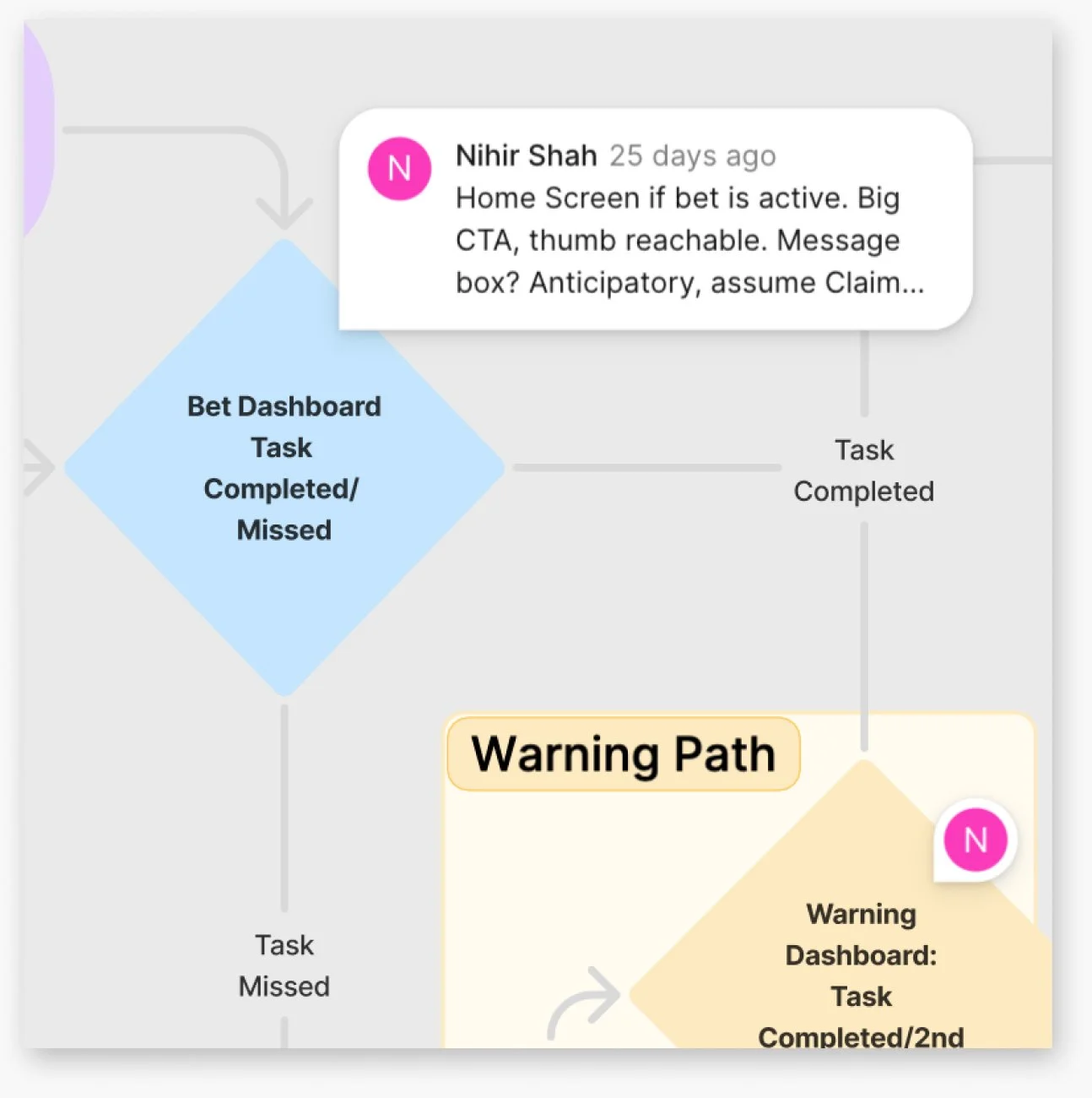
Claim a Payout or Add to the Pot
Completed a task? Request a payout. Missed one? Pay more into the pot. A penalty is 2x the payout amount, so two tasks must be completed to make it up!
Developing a Design POV
The experience can’t feel like another task to manage.
Many of the core dynamics at play—money as a motivator, breaking goals into smaller steps, celebrating small wins—are already well understood. So, rather than starting with traditional user research, I leveraged these familiar behavioral and interaction conventions and explored the problem through rapid prototyping.
To start, I oriented myself by imagining real moments of use:
A groggy student trying to shift to an earlier wake-up time needs clean visuals and to be in and out of the app quickly, without falling into their phone.
A busy parent squeezing in a workout needs to see progress at a glance and claim a win on the way out of the gym.
These scenarios helped guide early decisions and surfaced a core insight: the app can’t feel like another thing to manage.
With that initial POV, I moved fluidly between flow diagrams and wireframes to untangle the system. Going back and forth clarified structure, interaction patterns, and what needed to persist across screens. It also surfaced assumptions and generated ideas that I prioritized, tested, or parked for future iteration and research.
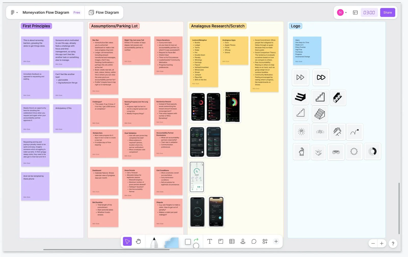
Exploring flows highlighted the dashboard as the natural home screen and surfaced which metrics actually mattered
People struggling with motivation need support to…
Get started when motivation is low
Feel encouraged without triggering avoidance
Reduce cognitive and interaction load
Make progress visible with minimal attention
Reinforce consistency
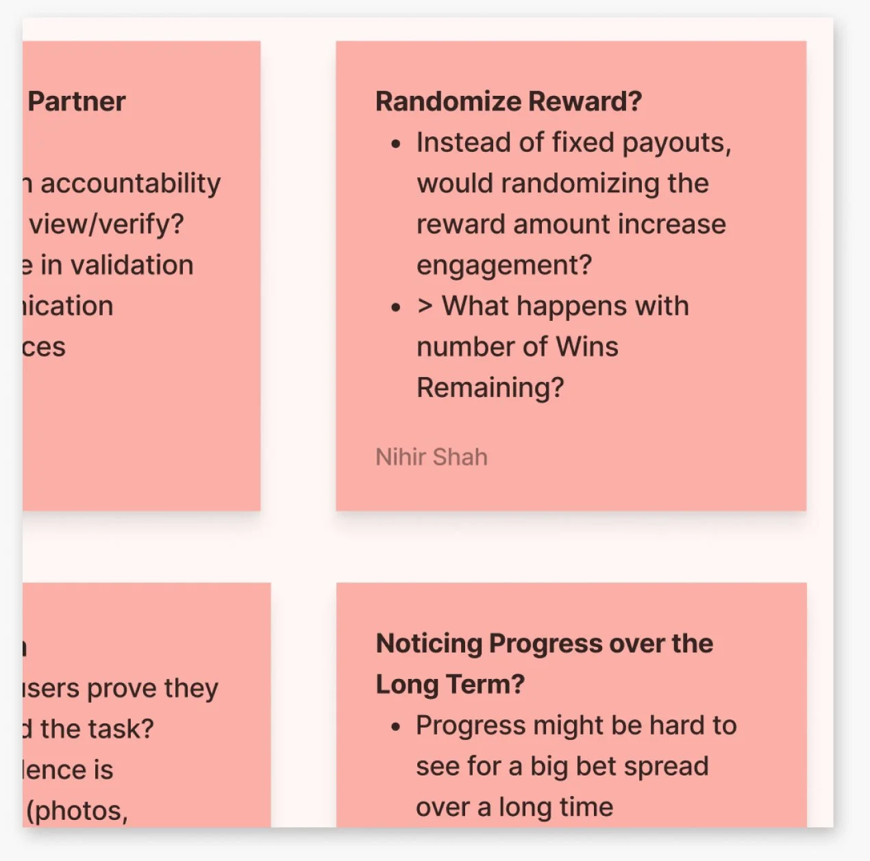
As they surfaced, ideas, open questions, and assumptions were captured for validation and future exploration.
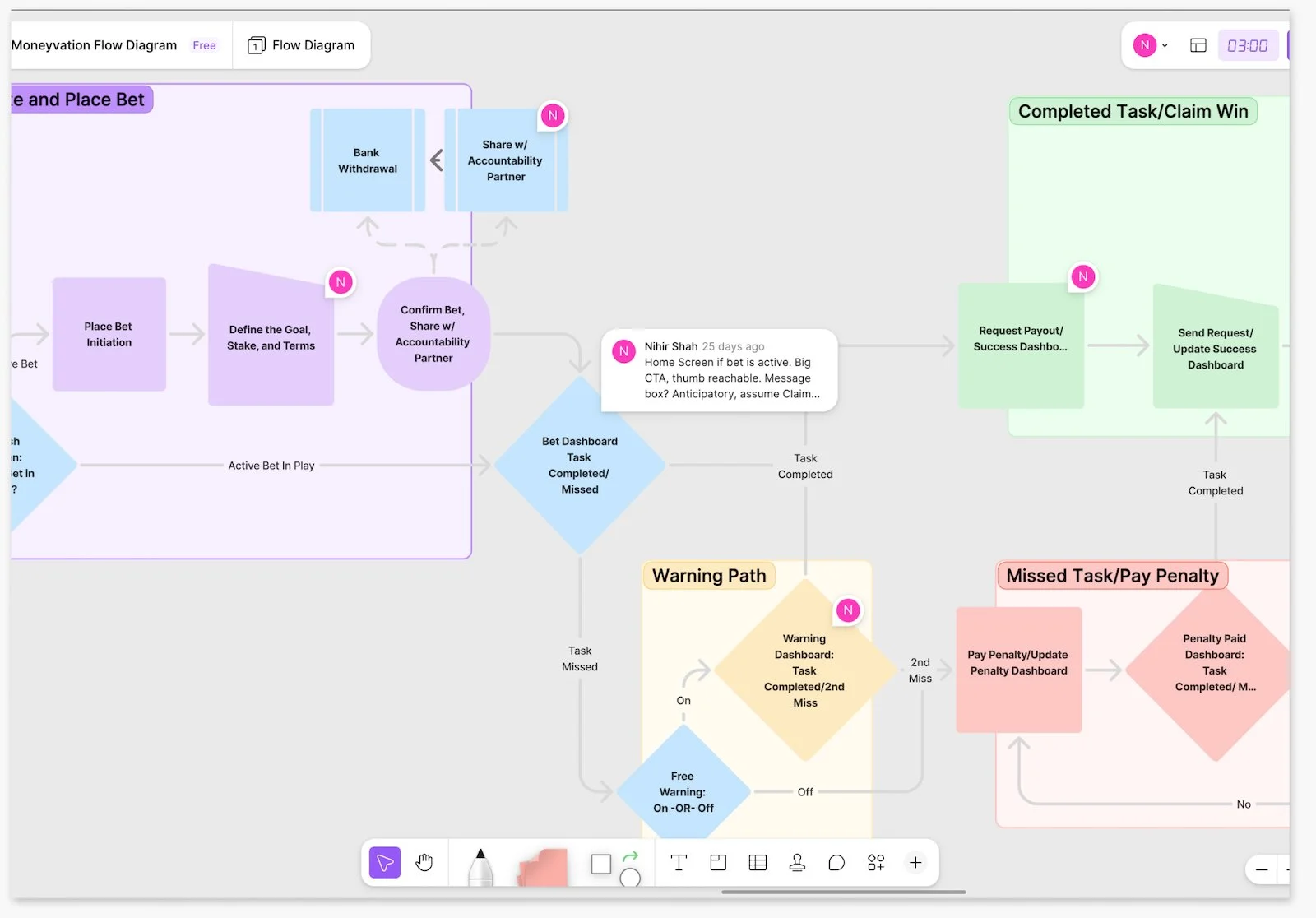
Wireframing affirmed a single, central CTA and highlighted which competing elements felt unnecessary.
Core Behavioral Principles for Motivation
-
Tangible stakes trigger loss aversion, while small rewards link action to outcome.
-
Leveraging our desire to follow through when others are involved.
-
Smaller steps reduce overwhelm and create frequent wins that build momentum and confidence.
-
Seeing movement toward a goal satisfies a sense of completion along with the need to close the loop.
-
Small, repeatable actions prevent burnout, sustain motivation, and reinforces continued effort.
Defining the Design Direction
A lightweight motivator that works in the in-between moments.
I learned that Moneyvation needed to give users the satisfaction of making progress, without becoming a task in itself.
Optimize for quick, low-friction, glanceable check-ins
Reduce decisions and interaction at the moment of action
Anticipate user action with prompt-driven interactions
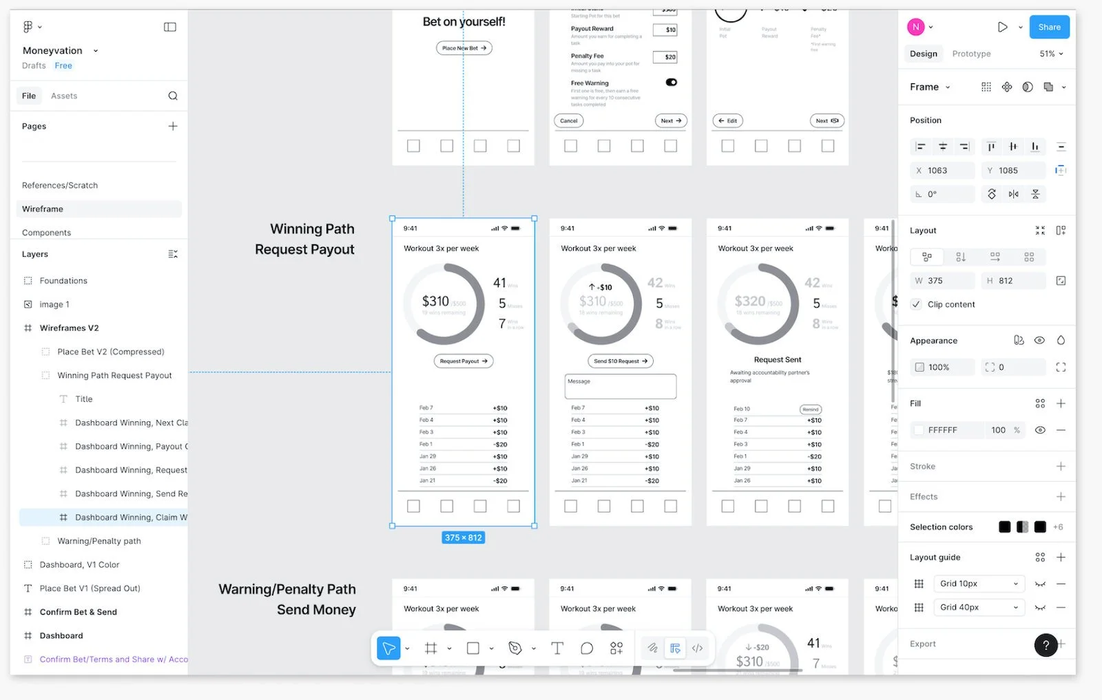
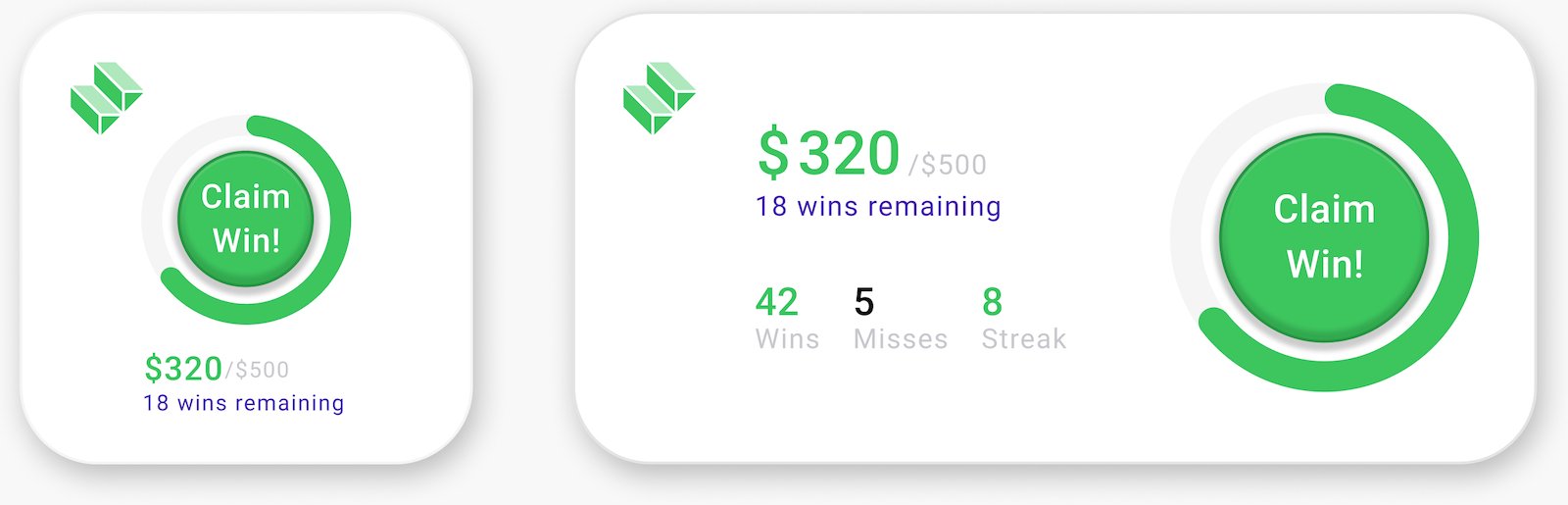
V1 Mockups
and Feedback
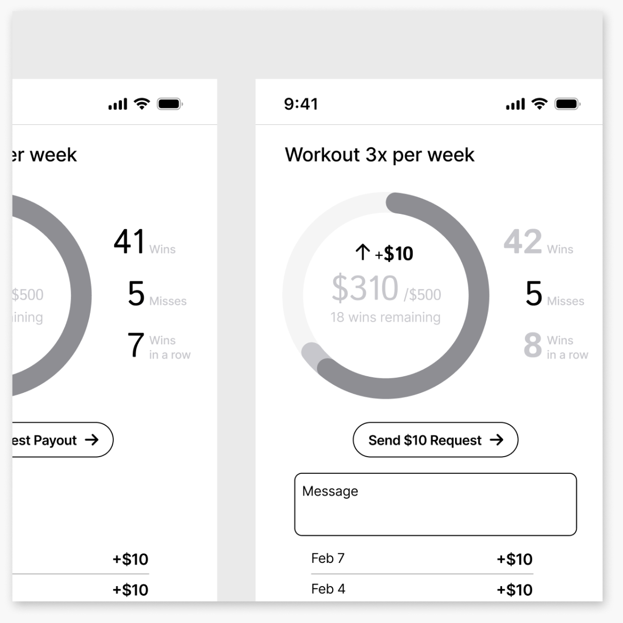
V1 mockups revealed competing elements—too much information, unclear hierarchy, and a primary action that needed more focus.
What worked? What didn’t?
Primary CTA
Clear, reachable, anticipatory prompt.
If this is the primary action, try increasing visual weight and tap target to match?
Ledger
History is secondary.
Move it lower and reclaim space for primary elements/tasks, but keep it accessible?
Progress bar + stats
Glanceable, but competes with the stats; hierarchy isn’t clear.
Try separating out the metrics?
Messaging / note
Crowds primary CTA. Maybe user only wants to add a note for misses (exception), but not when claiming a win (routine)?
Move to an on-demand interaction (add/edit secondary action) rather than persistent prompt?
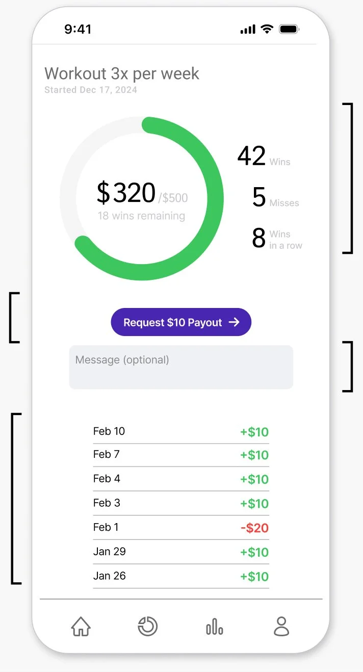
V2 Mockup
and Widget
V2 centered the experience to checking-in and checking-off. This focus also revealed the potential for a widget!
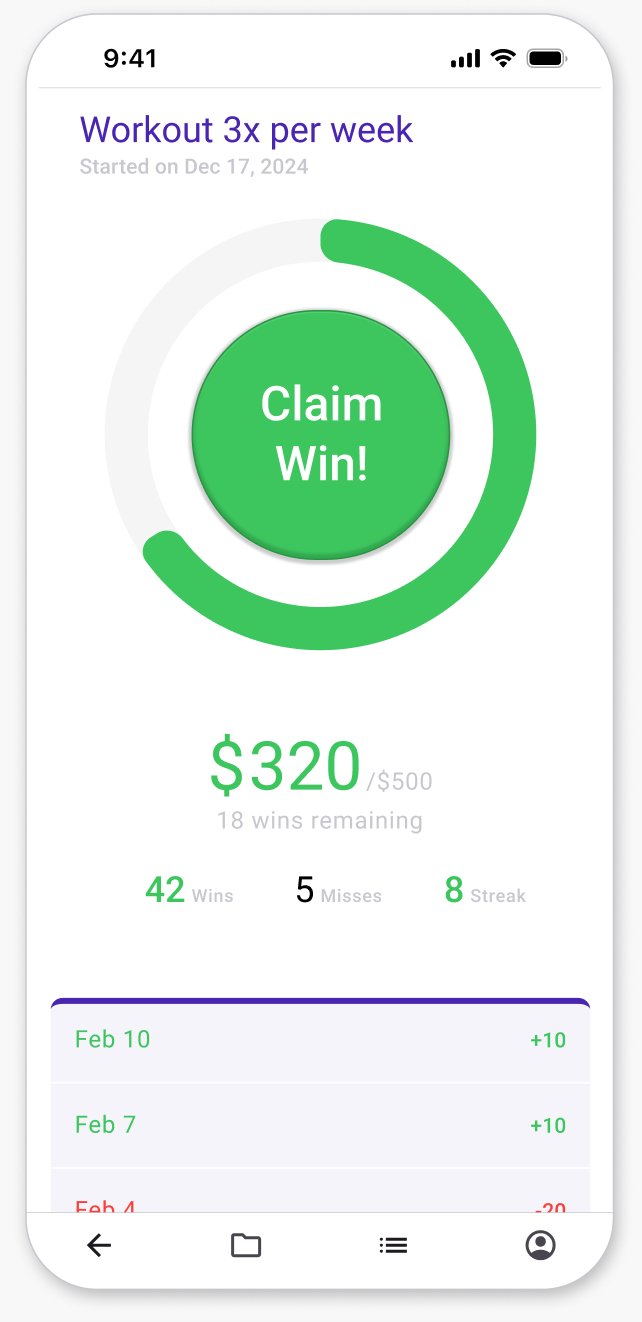
Clarifying the core need and action—checking progress and claiming a win or paying a penalty—revealed a multi-surface experience, with the widget supporting in-between moments, while the app serves deeper user.
Scope, Tradeoffs, and Next Steps
If I had more time…
-
Whether an accountability partner is necessary vs self-accountability, bot or real, and level of interaction
How users experience loss aversion over time, do penalties motivate follow-thru or become easy to ignore
Whether progress indicators (e.g. rings, ledgers) feel meaningful and legible at a glance, especially early on
-
Motivation drop-off, accountability dynamics, and long-term engagement—particularly where loss aversion or social pressure might fade
Which moments feel most emotionally charged (wins, misses, warnings, penalties)? Where to celebrate vs soften?
What if tasks are too ambiguous or subjective?
-
Challenges, sprints, bonus rewards, randomly-sized rewards that recharge engagement or reinforce consistency
Usage dynamics between widget and app
Social, optional community, or sharing goals
Ways to make daily progress feel tangible, especially at the start of long-term goals
If I had less time…
-
Placing a bet and claiming a win, to validate the core motivation loop and usability assumptions; claiming a win via widget
-
Warning and penalty flows that mirror the same structure and patterns, along with secondary information and edge-case handling (e.g. ledgers, multiple bets, progress indicators)
-
Keep the experience lightweight and anticipatory, maintain a single, clear primary action, and optimize for quick, glanceable check-ins
Revenue model/
Monetization Strategy
For consideration, Moneyvation could follow the PayPal/Venmo Model: As a custodian, Moneyvation would pool holdings to earn interest and invest in low-risk assets, while maintaining enough liquidity to cover withdrawals.